Asuka's Desktop VS. Mobile.
practice (optionl) task.
final task.
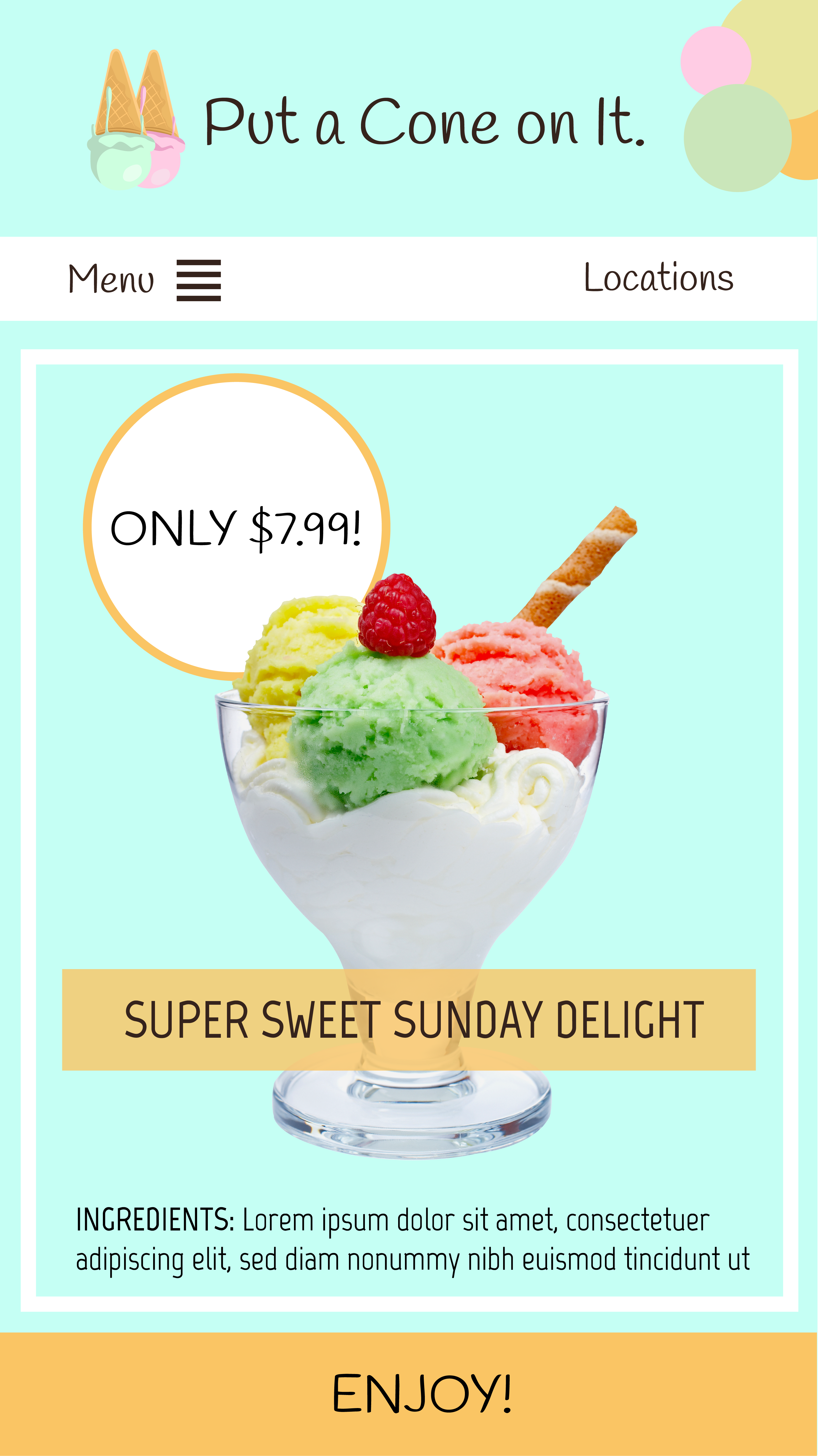
 Explanation: I would add a hamburger style navigation bar instead of the normal nav bar. I would keep menu and location as the two main links. I would remove the sidebar and include the information elsewhere on the website. There would be only one picture of ice cream at a time as you scroll instead of multiple columns. The logo and name of the company would be smaller and the logo would be beside the name instead of under.
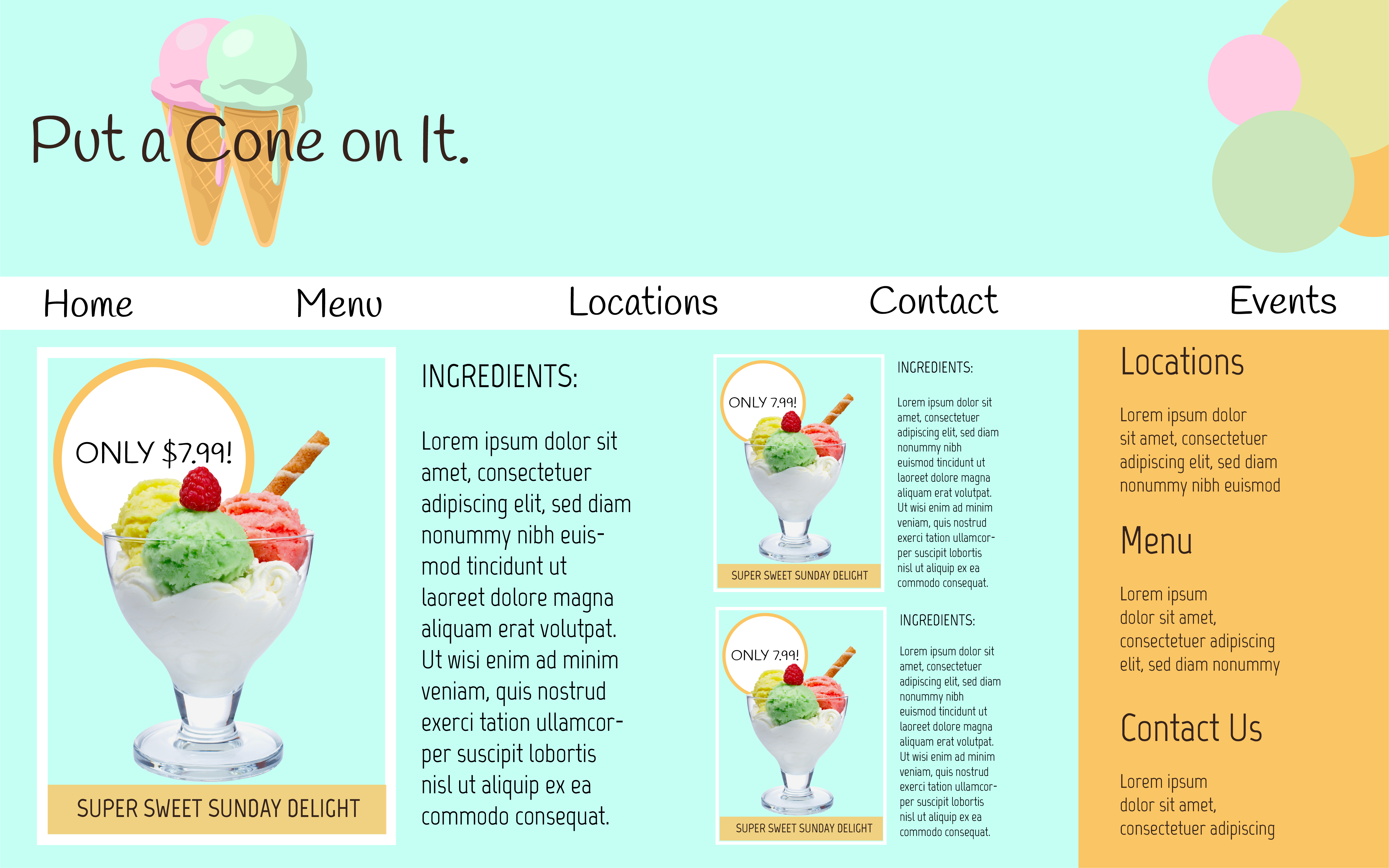